Today we welcome guest bloggers Régis Longchamp and David Reksten, FME Certified Professionals from INSER. They will share part of an example they created for a client, which uses Tableau and FME to create a cartographic representation of the population distribution in Switzerland. INSER is a GIS consulting company based in Lausanne, Swizerland, and has been a Safe Software Gold Partner since 2005. This post originally appeared in French on INSER’s website.
Tableau is a software package for analyzing and visualizing data aiming to simplify and facilitate decision-making. Thanks to the VisQL technology (drag and drop to create queries), Tableau has the possibility to consume data from different sources and to visualize them in a simple and intuitive manner. It is in this context that FME can play an important role.
To illustrate the synergy between FME and Tableau, we have created this real-life use case based on the official Swiss population data. The dataset is a collection of polygons representing each of the 26 Swiss cantons, with an attribute for each polygon indicating the number of inhabitants. The goal is to create a cartographic representation that differentiates each canton based on the number of inhabitants.
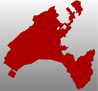
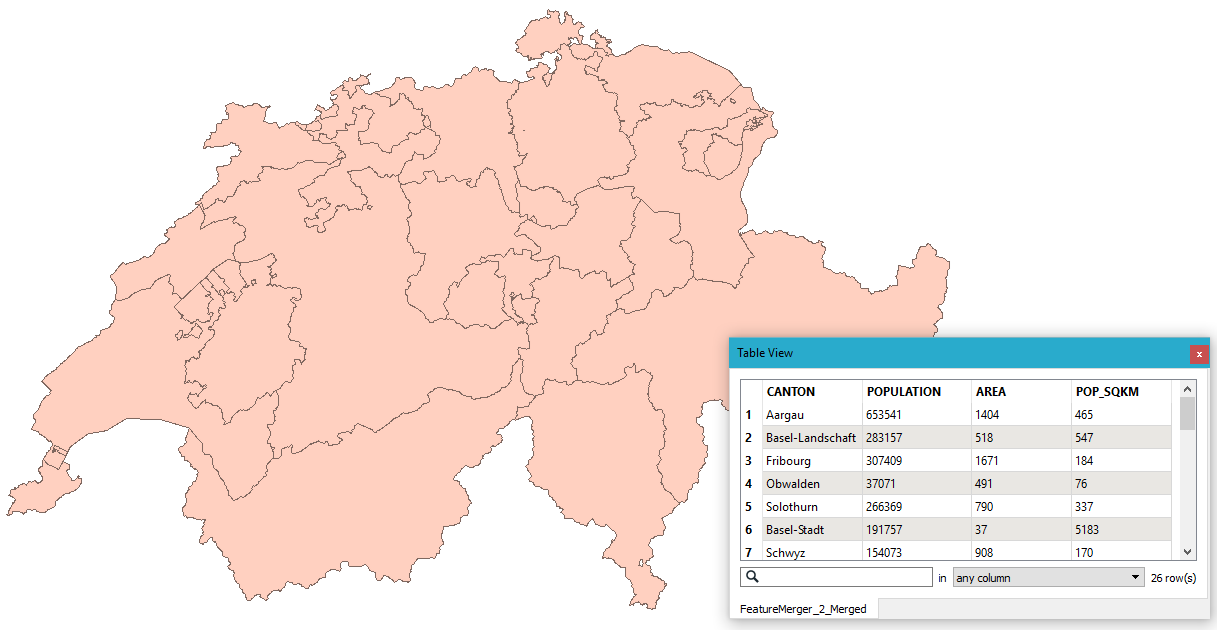 What We Have |
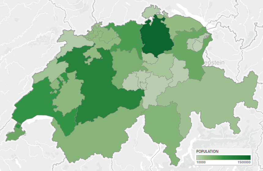 What We Want |
In FME
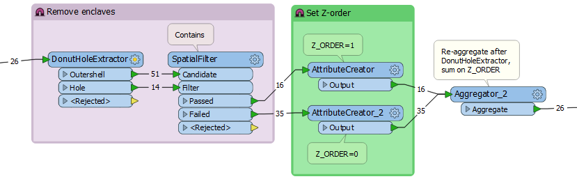
First, we will be reading the input data using a Reader, in our example the data exists in an Esri File Geodatabase. Tableau does not currently support donut polygons, and since the Swiss cantonal limits contains quite a few enclaves we will have to remove the holes to convert the donuts into simple polygons. Here’s an example from the canton of Vaud:
 Before, with holes |
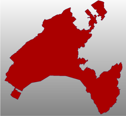 After, without holes |
This can be done by separating the holes from the outer shells, then filtering out the cantonal enclaves by checking if an outer shell is contained by another outer shell. Since the DonutHoleExtractor decomposes our aggregates, we have to use an Aggregator to assemble them back together again after.
We will also be populating a new attribute, Z_ORDER, so that we can control the drawing order in Tableau, this is to prevent smaller cantons that are wholly surrounded by a larger canton to be overlapped, now that the larger canton no longer has any holes.
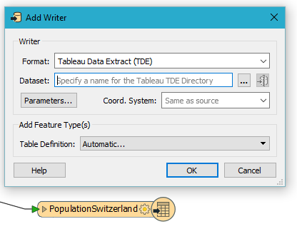
To write the output dataset, we add the “Tableau Data Extract (TDE)” Writer that was introduced in FME 2016.
Note that Tableau expects the data to be projected in WGS84 Lat/Long, which FME will automatically do for you if you just make sure that the input data is tagged with its corresponding projection.
If your geometries are large and contain a lot of vertices, you might notice that Tableau can take a while to refresh the visualizations. In those cases it can be very helpful to pre-process the data with a Generalizer to reduce the number of vertices before writing the data. For our dataset we set “Preserve shared boundaries” to Yes to preserve the topological relationships between the cantons.
In Tableau
After FME has written the Tableau Data Extract file, simply double-click the TDE file and the data will open in Tableau Desktop:
In Tableau the geometries are stored as a list of vertices, with all the attributes attached to each vertex. This means that it can be a good idea to reduce both the number of attributes and vertices in FME before saving the TDE file, reducing the memory load and improving performances in Tableau later on.
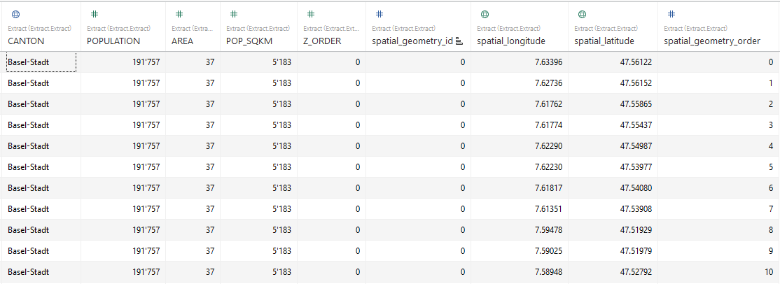
We see that the vertex coordinates (spatial_longitude and spatial_latitude) for all the geometry parts are shown, as well as the vertex order (spatial_geometry_order) and the part number (spatial_geometry_id). We also see the attributes we specified in our Writer: CANTON, POPULATION, etc.
Visualizing polygons in Tableau differs a bit from software used by most GIS professionals. From the raw data view we must
- Open the “Sheet1” tab in Tableau to open the main canvas
- Double-click the longitude and latitude attributes to set them as the column and row dimensions respectively. The data view should now change to a map view.
- Select the polygon representation in the “Marks” drop down list of data representation types
- Drag the POPULATION measure and drop it onto the Color category
- Drag the Z_ORDER measure under the POPULATION mark.
- Drag the “spatial_geometry_id” dimension under the Z_ORDER mark. This groups the vertices according to their part id (for multi-part geometries).
- Drag the “spatial_geometry_order” dimension onto the Path category This ensures that the vertices are drawn in the correct order.
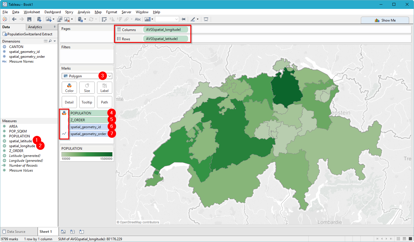
And there we have it, thanks to FME we now have our canton polygons visualized in Tableau according to population numbers. We can now continue to overlay other data and start analyzing them in new and informative ways.
Conclusion
Thanks to this simple example we can see the potential when combining FME and Tableau.
For the Tableau users, FME gives them the opportunity to perform powerful and dynamic spatial analysis. In addition, the vast number of formats supported by FME gives them the possibility to integrate even more data sources into Tableau.
For the FME users, Tableau offers the possibility to quickly visualize and present data in new and exciting ways, combining both spatial and non-spatial data for support in decision-making.
Try it yourself: Download FME Workspace, Tableau Workbook, data, and TDE file
 |
Régis Longchamp is a GIS Analyst at INSER. He has a Masters degree in Environmental Sciences and Engineering from École Polytechnique Fédérale de Lausanne (Switzerland) with a specialization in Geomatics. He is an FME Certified Professional. |
 |
David Reksten is a GIS Analyst and Developer at INSER. He has a degree in Computer Engineering from the University of Oslo (Norway). David is an FME Certified Professional and a top leader in our FME User Community. |

Want to learn more about FME and Tableau? Check out these blog posts:

Make it Spatial: Enhancing Your Tableau Viz with Location
Find out how organizations are using FME with Tableau’s amazing BI platform to blend together spatial and business data, enrich their datasets, and automate workflows for even more sophisticated data visualizations and analysis.
6 Tableau Tasks You Didn’t Know You Could Do
Thanks to Safe Software’s partnership with Tableau, you can blend any data in any way you want and augment it with spatial information. Here are a few bonus tasks you can do in Tableau to create even better visualizations, with the help of FME as a data prep tool.

Roger Aikema